Posts

Showing posts from November, 2020

Autoscopy Project

Image
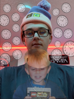
  This project was interesting to say the least! I wanted my project to revolve around the idea of aging, and how time is affecting all of us. After working in photoshop for a bit I came up with this image! I took a picture of my young self and placed it in front of me. Obviously behind me are about a million clocks! This is to symbolize time. As well, I darkened my eyes using a starry night sky. Came out great!  I then placed a grainy filter over it to achieve a more dark and scary vibe.  The next step was to change the quality of the image. Those are below! 0 25 50 75 100 It's interesting to see the difference in image quality! Next I restricted the colors and played with the dithering tools to create some other images. Overall I think they came out quite interesting.  I think if I was to play with the colors more I could've achieved something a bit more interesting but I am definitely happy with the final product.

Multiplicity Project

Image
  Wow! I loved this project. The area I picked for my project was my dorm room. Really simple, but the lighting in the room made it the prime location for the set up. First, I set up and took my 6 shots! I basically just sat around my room in places that I thought would interest the viewer. My favorite interaction would have to be with me at the desk vs me at on the bed! I loved the idea of pretending I was looking at myself and I think it came out great in the final product.  Which is here! I think this project was the one I had the most fun with overall! It was fairly simple to put together and I loved working with my room. I also really really love the final product!

Black And White To Color Project

Image
  The black and white to color project was one of my favorites. I took a picture on a blank background with one of my favorite shirts so that my body image was able to pop more. This made the project much easier as I didn't have to work too much with the background. From there I worked on finding my initial color palette. I wanted something that was extremely vibrant in colors and whacky.  The colors reminded me a lot of cotton candy, especially the blue. They were perfect! After finding my palette, I completed my first image. And I loved it! I really thought the vibrant colors popped together really well. I think I could've been more creative with my shirt design, but other than that, I think it worked really well. After finishing, I converted two other images using different pallets! Here they are: I actually really loved the second of the two but the red one was a little odd for me. Overall my favorite is definitely still the one that reminds me of cotton candy.