FMX 210 Illustrator Project
For my logo project I wanted to encapsulate an idea within an image through a creative use of the word inside of a logo rather than just an object or simplistic design. When I began the project, I came up with the following words to describe myself.
Musical:
My current passions are present in music. I like both composing and producing music, and I enjoy to sing and on occasion play guitar. I thought with all the symbols encapsulated in music that it would be pretty easy to find one that fit a logo design.
Loving:
I believe that I am a very loving person. I enjoy spending time with those that I love and rely a lot of the relationships I have with people to keep me going throughout the day. I believe that without the ones I love, I would probably be a shell of who I am today.
Witty:
Probably my favorite of the choices I selected. I love the word itself and its meaning. I think it is a good description of me because although I am intelligent, a more accurate description of the way my mind words is closer to this word. I am a creative thinker and can use my ideas in many problem-solving ways.
Kind:
I am an extremely not combative person and hate conflict. I try to resolve all conflicts with other people as simply and quickly as possible. I am also apologetic, which many people think is a common trait of someone who is nice / kind. As well, I think being an nice person to everyone you meet is the best way to meet and make new friends.
Energetic:
For a long time people told me I have too much energy and need to relax. Although this trait was more present when I was a kid / teenager, I thought the word could possibly pose some creative designs for a logo.
I then went into creating mood boards for my words. Here they are:


After deciding on my words and making mood boards, I worked on some logo ideas. I did some research on what types of logos people have made for words similar, but wasn't finding a lot of inspiration. I decided to just take a shot in the dark at some ideas:


I thought simple because I am not the most artistic person. I think of the ideas present, the ones that stood out the most were the final one for energetic, and my final one for witty.
Ultimately, I went with witty, because I thought it was my most creative design. I think a tic-tac-toe board is a perfect example of a game that requires wit rather than skill or intelligence.
After drafting some ideas within illustrator, I came up with this:

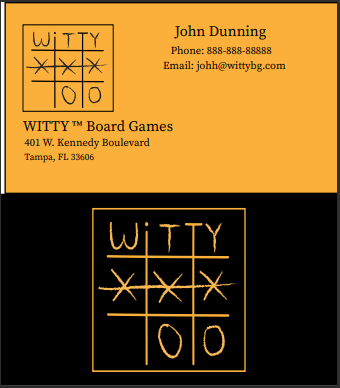
I then applied it to what I thought may be some pieces that the company would use in some of their board games.


Comments
Post a Comment