Posts

Animation

  Feels like we just started and yet here we are; the final project. For my animation I took inspiration from my father, who I saw juggling the other day. I realized that the motions he was going through would look great in an animation. I found a video that I thought suited my inspirations and downloaded it + turned it into a 20 second clip to use to render my animation. It was perfect. (Link: https://www.youtube.com/watch?v=kR1sU1X9bfc) After tirelessly putting frame after frame together, I was finally able to come up with my final product. It took a great deal of time and effort but I love what it ended up being. Very happy with the result and what I learned during the course. Thank you again to my teacher Santiago Echeverry for everything I learned in this class.
Autoscopy Project

Image
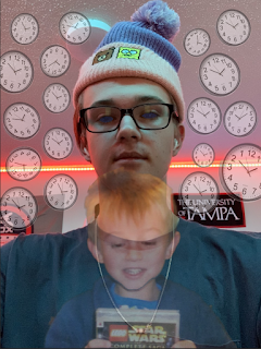
  This project was interesting to say the least! I wanted my project to revolve around the idea of aging, and how time is affecting all of us. After working in photoshop for a bit I came up with this image! I took a picture of my young self and placed it in front of me. Obviously behind me are about a million clocks! This is to symbolize time. As well, I darkened my eyes using a starry night sky. Came out great!  I then placed a grainy filter over it to achieve a more dark and scary vibe.  The next step was to change the quality of the image. Those are below! 0 25 50 75 100 It's interesting to see the difference in image quality! Next I restricted the colors and played with the dithering tools to create some other images. Overall I think they came out quite interesting.  I think if I was to play with the colors more I could've achieved something a bit more interesting but I am definitely happy with the final product.

Multiplicity Project

Image
  Wow! I loved this project. The area I picked for my project was my dorm room. Really simple, but the lighting in the room made it the prime location for the set up. First, I set up and took my 6 shots! I basically just sat around my room in places that I thought would interest the viewer. My favorite interaction would have to be with me at the desk vs me at on the bed! I loved the idea of pretending I was looking at myself and I think it came out great in the final product.  Which is here! I think this project was the one I had the most fun with overall! It was fairly simple to put together and I loved working with my room. I also really really love the final product!

Black And White To Color Project

Image
  The black and white to color project was one of my favorites. I took a picture on a blank background with one of my favorite shirts so that my body image was able to pop more. This made the project much easier as I didn't have to work too much with the background. From there I worked on finding my initial color palette. I wanted something that was extremely vibrant in colors and whacky.  The colors reminded me a lot of cotton candy, especially the blue. They were perfect! After finding my palette, I completed my first image. And I loved it! I really thought the vibrant colors popped together really well. I think I could've been more creative with my shirt design, but other than that, I think it worked really well. After finishing, I converted two other images using different pallets! Here they are: I actually really loved the second of the two but the red one was a little odd for me. Overall my favorite is definitely still the one that reminds me of cotton candy.

Poster Project

Image
  For the poster projected I was determined on using a photo from my graduation. After a pretty lengthy selection process I settled on this photo from that day about 5 months ago. I thought the picture had a great balance of bright and vibrant colors, and I loved the way the yellow piece of my hat looked against the blue of my attire. I also thought the bright pink flowers in the back were gorgeous, and the sky would be another great part of the piece. I had to find a color palette that suited most of if not all of the colors within the picture, and after looking on adobe.com, I was able to find a decent palette. The blue and golden colors matched almost perfectly to my graduation gown, and my sky blue and flower pink were also present as well. After some hard work, I finished the piece. Here is the final result: I loved the message I went with because it was associated with graduation and education. I think it fit perfectly. The only real detail that I was upset about were the eyes. I

Calligram Project

Image
  For the Calligram project I picked out a picture of my trip to Hawaii. I thought it was a good shot that had vibrant colors to follow while also exemplifying my facial features.  Here is that picture:  After working out the details of my writing and figuring out the most important pieces of my life in words, I completed the assignment and this is final project. I think I was able to catch the facial features appropriately, but definitely could've done a better job of filling in the features of my face to create more of a skin layer. Overall it was a fun learning experience creating the project. My most important words represented are the ones that are down my neck and across my hairline. They are significant portions of my writing that I think stand out the most.   

FMX 210 Illustrator Project

Image
For my logo project I wanted to encapsulate an idea within an image through a creative use of the word inside of a logo rather than just an object or simplistic design. When I began the project, I came up with the following words to describe myself.  Musical: My current passions are present in music. I like both composing and producing music, and I enjoy to sing and on occasion play guitar. I thought with all the symbols encapsulated in music that it would be pretty easy to find one that fit a logo design. Loving:   I believe that I am a very loving person. I enjoy spending time with those that I love and rely a lot of the relationships I have with people to keep me going throughout the day. I believe that without the ones I love, I would probably be a shell of who I am today. Witty: Probably my favorite of the choices I selected. I love the word itself and its meaning. I think it is a good description of me because although I am intelligent, a more accurate description of the way my m